Solution
Wend is a comprehensive travel planning app that centralizes information from various booking and informational websites and streamlines group and solo planning processes, increasing a planner’s confidence and satisfaction.
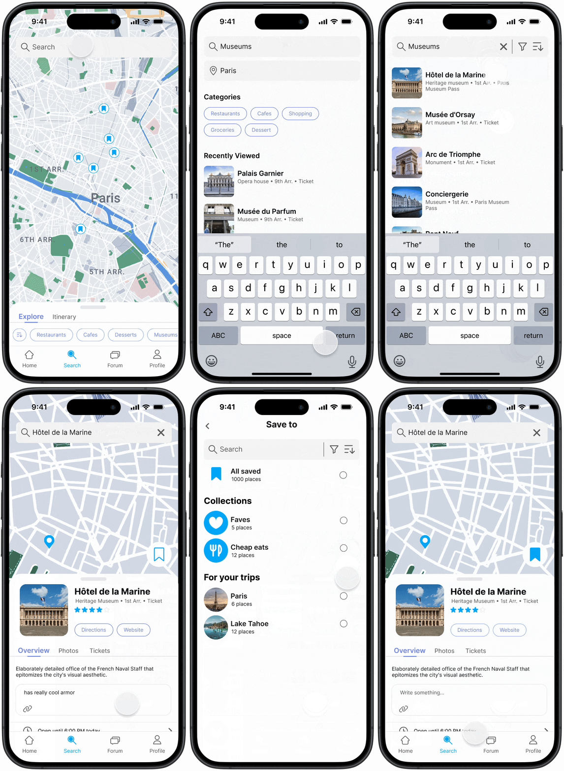
Easily save locations
Travelers can keep note of places they find during daily social media browsing or add locations to their trip for consideration.
Automatic comparison features
Intuitive visuals paired with filters present the optimal booking choice for travelers.
Flight comparison
Hotel comparison
Simplified decision-making through voting
Group decisions are efficiently made through a voting process.
Learn Unique Perspectives
Find unique insight based on other’s firsthand experiences.
View saved from map
Itinerary access via search
Relative location comprehension
The map view displays saved and itinerary items, making it easy to find activities near a location.
process
This was the process we followed through each stage of this project.
We started with identifying effective research methods and formulating research questions to guide our methods and research goals.
Research
Research questions to create actionable goals.
Formulating research questions guided us when conducting literature reviews, a comparative analysis, and writing survey and interview questions.
1.
What are certain obstacles or barriers to people in finding logistical information (ex. flight information, hotel pricing) about their trips?
2.
What are the motivations behind travel and how it dictates people’s preferences?
3.
What aid would make trip planning easier and more efficient? What level of clarity should certain aspects be at for a person to feel secure about the trip?
4.
What facilitates compromise between individual interests in a group setting?
competitive analysis
Through this, we found that most apps offer suggestions for attractions and tourist destinations, but none offer a good way to facilitate efficient decision making in group trips.
survey
We first used a survey to 1) help us narrow down our target user demographic and 2) learn what they prioritized in their travel planning process.
We also asked open-ended questions about their planning process in solo and group trips, what they found successful in a trip plan, and for general insights. We converted these responses into data points, then affinity diagrammed them to develop four key insights.
research synthesis
Key Insights
1.
Travelers want to utilize multiple sources and references while planning.
REFRAMED INTO:
HMW help compile and streamline information in a easily understandable manner?
2.
Showing various comparisons to travelers optimizes time and boosts mental security.
REFRAMED INTO:
HMW clearly show differences in options to facilitate travelers’ ease and comfort throughout planning?
3.
Fully informing travelers about their decisions encourages satisfaction and confidence in their plans.
REFRAMED INTO:
HMW inform travelers’ decision-making so they feel confident and satisfied with their plan?
4.
Allowing flexibility in responsibilities based on the interest in involvement makes the planning process more efficient in a group.
REFRAMED INTO:
HMW encourage flexibility based off interests in involvement to maximize efficiency in group planning processes?
design goals
Using our new HMWs, we created four design goals that would guide our design process.
1.
Easy & intuitive saving features that centralize information
2.
Modern + approachable interface for people new to planning
3.
Easy to access additional information about any subject
4.
Facilitating accessible information so everyone is represented in the group
User personas
Data-driven user personas
User personas helped us consider the different goals and motivations of different potential demographics. Presenting our data as personas helped us brainstorm tangible features based on our design goals.
Concept development
Site map
Creating a lo-fi prototype allowed us to experiment with different features. We chose to utilize to many existing design patterns but also wanted to conduct testing with different layouts to get user feedback on what was most intuitive and helpful.
Wireframe
Initial sketches
lo-fi prototype
Testing
Refining features via semi-structured interviews
After creating our Lo-fi prototypes, we conducted 5 semi-structured interviews through speed dating. In these interviews, we conducted A/B testing with different features and presented key interactions within the app.
These are two of the features we A/B tested with:
Putting a saved item for vote
- Having a liked feature along with vote feature was redundant because the message communicated by both features was the same
- Using a check mark as a symbol for voting was unintuitive
- The vote button needed to be visible upon entering the page to make it clear the feature was available
Voting screen
- We needed to find the right balance for the amount of space each type of information occupied because of differing values.
- Ex. Some people highly valued other’s opinions when making their decisions, while others did not factor that into their decision.
- It was easy to miss the information about date/time when it was grouped with the location information.
Through testing, we also gained overall design insights that we could implement to all pages.
- Iconography can easily cause confusion
- Core features must have high visibility
- Removing redundant/ similar steps made features more straightforward
- It’s important to consider how different pages and components look in relation to each other
- Organizing and distinguishing different types of information visually eases comprehension
Page experimentation & ideation
Improving usability through subtle visual changes
We experimented with different versions of the app design system and page designs to see what visual design best aided the information hierarchy. Here are a couple of examples.
Using outline vs. off-white for chunking
We chose to use an off-white background to separate different blocks of information vs. the outlining each block, since it created a greater visual distinction between each block. This improves the user’s ability to process the information.
Adding to vote from saved
We wanted to incorporate gradients seen in the logo subtly in the app, and experimented with different gradient colors and directions. We ended up using the left design because there was higher contrast and visibility of text.
Branding
Minimal and calming design system
Based on our design goals, we decided to use a color palette that promoted readability and understanding via a minimal interface.
For our logo, we chose to incorporate visual motifs of land, air, and water.
Reflection
Wording is important!
The small nuances between words like “Liked”, “Heart”, and “Saved” often caused confusion while me and Sophie were discussing and also with users during testing. This confusion pointed out the importance of having lo-fi prototypes or visuals to accompany discussion. At the same time, I learned to be more mindful with wording and iconography to increase clarity.
Targeting user personas
I underestimated the usefulness of creating user personas in the research process. Later on, when we were prototyping Wend, thinking aloud through the app in the shoes of a user persona reminded us of missing features and unaddressed pain points. Creating these personas and utilizing their personality traits and goals helped us fully account for the different user flows and features that would be used throughout the app.
Balancing conflicting feedback
In our surveying and testing process, there would often be conflicting opinions between different people because everyone has different values. This recurring pattern helped me exercise different ways to design for a middle ground.
Next steps...
- Additional user testing with the high fidelity prototype
- Ideating and creating more features that directly aid in research and planning